Freddy’s
Client: Schmidt retail concept
Brand: Freddy’s
Project: Brand & packaging design
The Brief:
Create the brand of a local fruits and snacks shop.
The Solution:
After conducting a brand audit, it was obvious that the main advantage of the brand was given by the natural benefits and the proximity.
The big idea was to translate the natural benefits and the proximity into a simple and smart visual language.
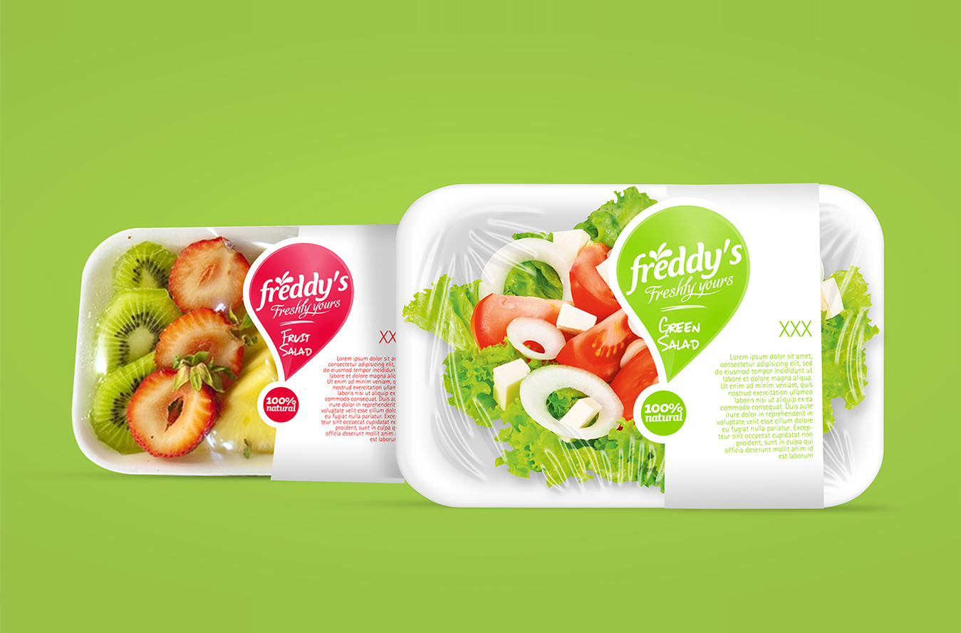
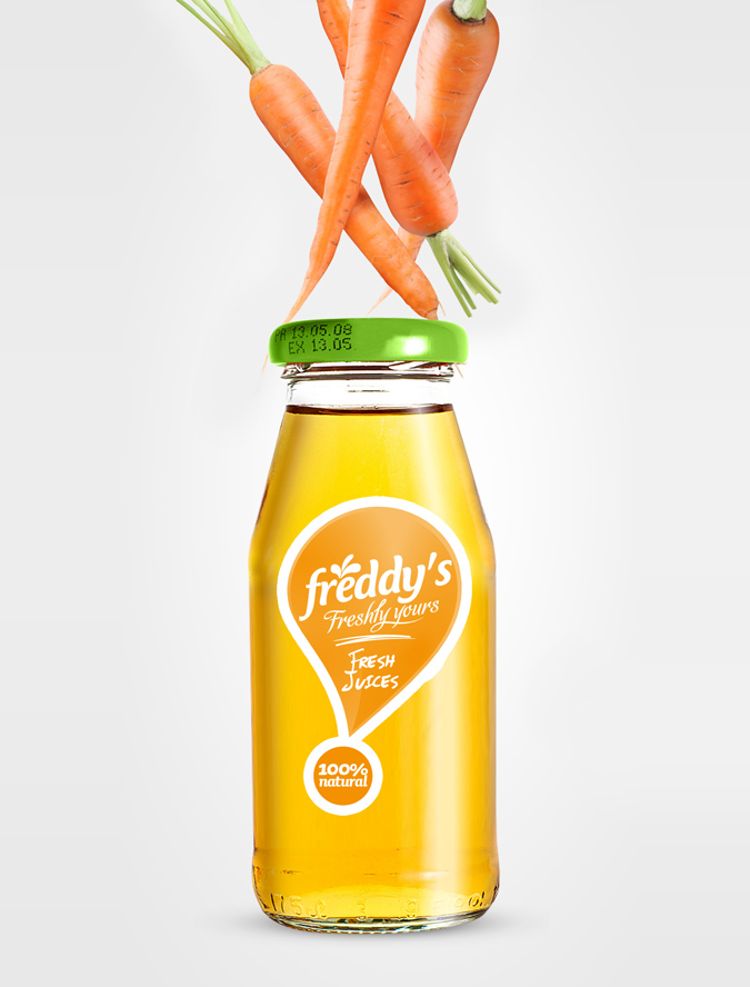
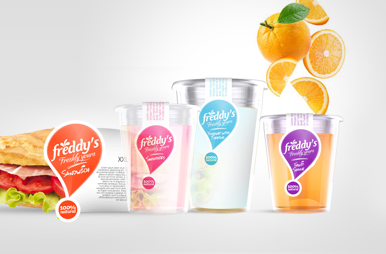
Starting from a splash (from the logo), we created the iconic packaging design: “the exclamation sign”. All the packages are one color printed, in order to fit within the given budget, but also to show diversity in the shop (we have one different color on the pack for each product).
Share