Nestlé – Mura
Client: Nestlé Bulgaria
Brand: Mura
Project: Packaging redesign
The Brief:
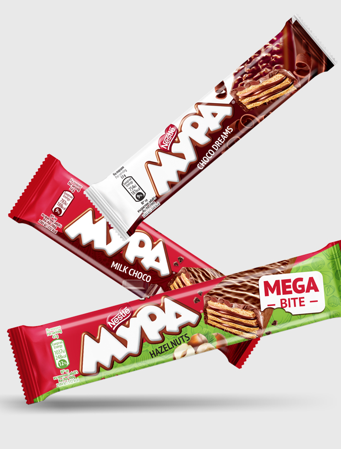
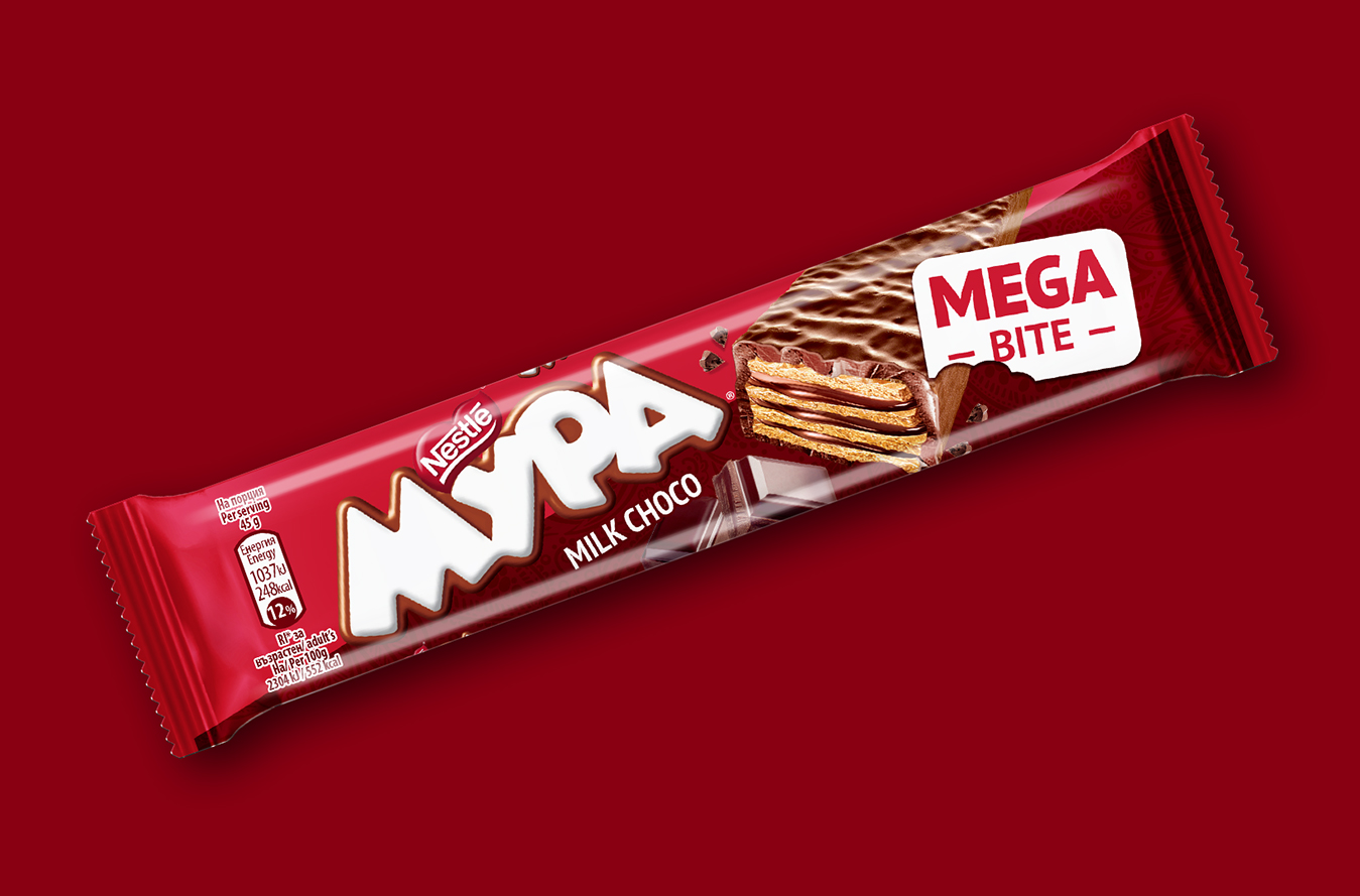
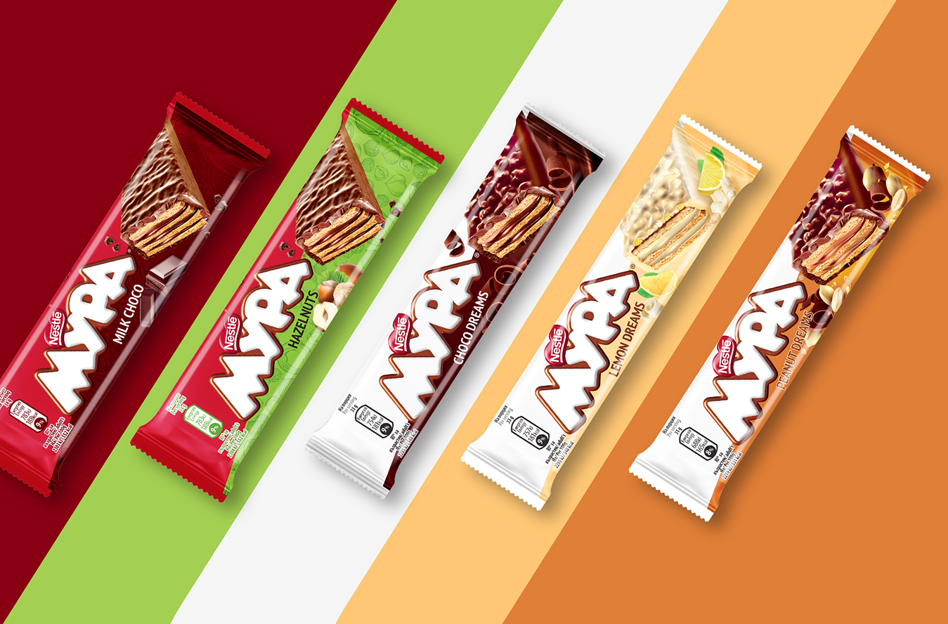
Mura is an iconic wafer brand in Bulgaria and our mission was to redesign the packaging in order to strengthen the visual identity and rejuvenate the brand. Leveraging the brand heritage and positive image, ensuring improved visibility and stand-out was a must. Another important objective was to better organize the ranges in terms of visuals, with a clearer differentiating system.
The Solution:
After conducting the brand audit, we concluded that we needed to balance the brand signal and the flavor color-coding.
So, the new front of pack was developed in a diagonal visual system, where the brand color is on the upper side, while the product-related visual cues and the flavor color-coding are on the lower side.
This new front of pack architecture ensures a great brand block with a good flavor differentiation on any packaging format: landscape, square, or portrait.