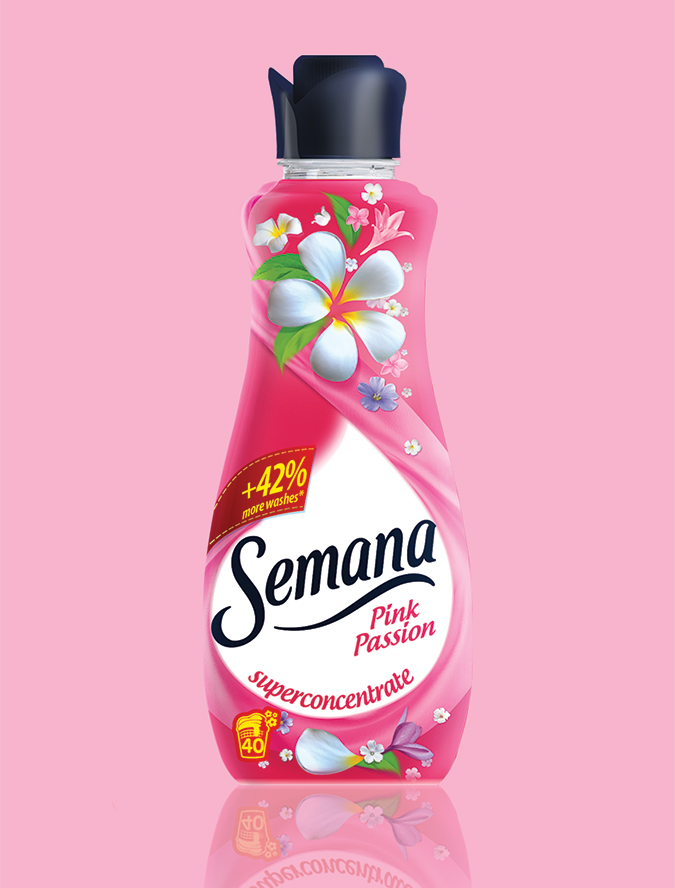
Semana
Client: Ficosota
Brand: Semana
Project: Packaging redesign
The Brief:
Semana is the upper mainstream softener brand of Ficosota. Our mission was to redesign both Semana product sub-brands: Semana Moon Flower in the premium segment and Semana Extra Fresh in the mainstream segment.
The Solution:
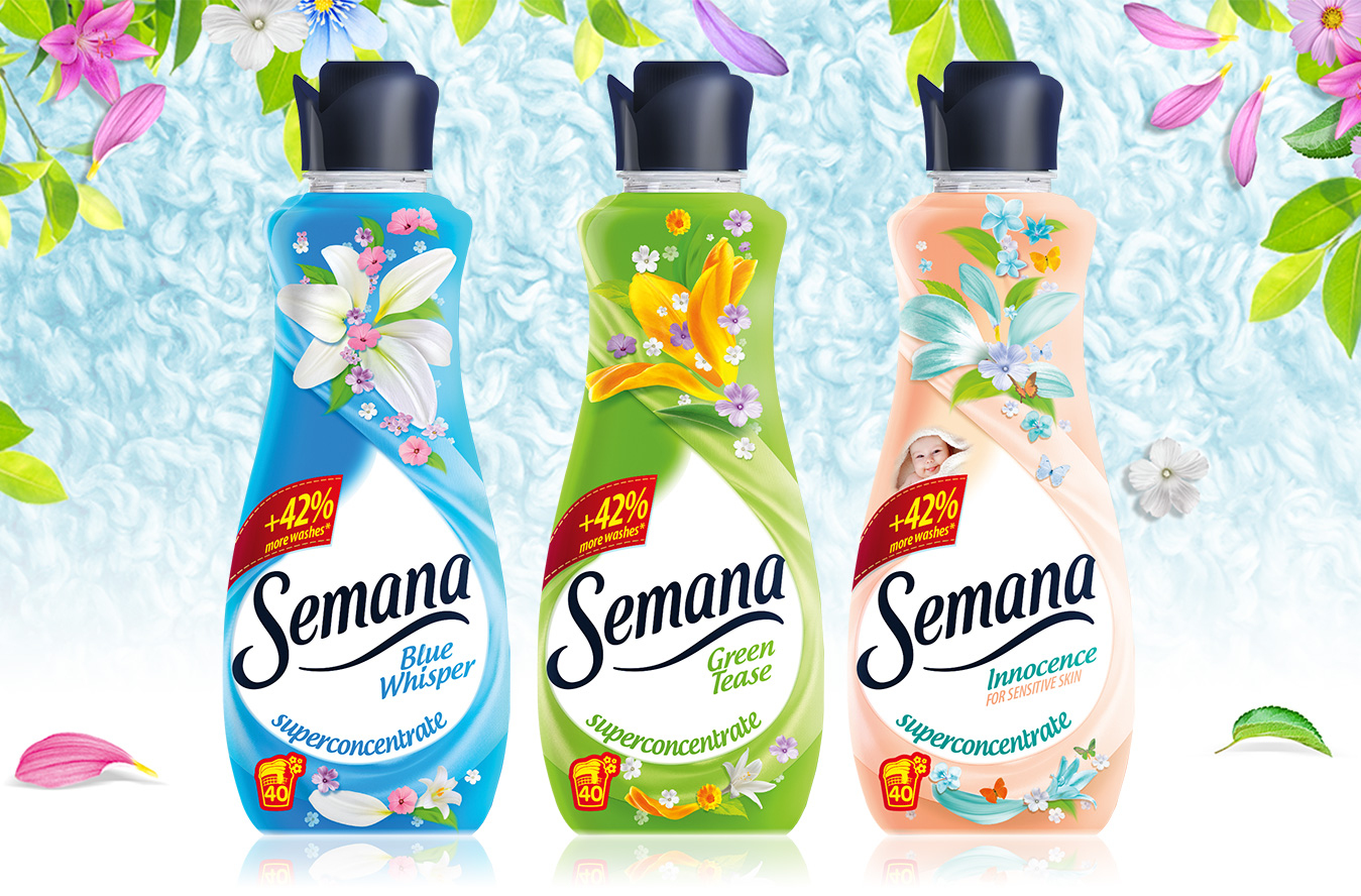
After analyzing the shelf value and the hand-value of the Semana existing packages, the main priority was to redefine the front of pack architecture, in order to have a good and comprehensible hierarchy on the new packages.
For the Moon Flower range, our creative idea was to use black as a brand signal, balanced with a discrete lace-inspired pattern for the premium look & feel. The flavor differentiation is made by the colorful flower at the center of the pack, but also by the flavor descriptor.
For the Extra Fresh range, the creative concept was “Dynamic flower petals”. We reorganized the front of the pack for a better brand visibility and we changed the entire visual universe, from a static, illustrated one to a new, dynamic visual style, and based on the flower petals.