Galactic Chocolate
Client: Food Distributione
Brand: Galactic
Project: Packaging redesign
The Brief:
Galactic is a local mainstream chocolate brand.
Our mission was to redesign the Galactic chocolate packaging in a very competitive and dynamic market in order to ensure a better brand recognition.
The Solution:
The chocolate is an impulse product in a crowded market.
So, you have a very small shot to be noticed on shelf!
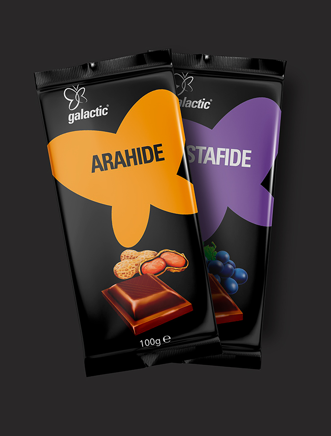
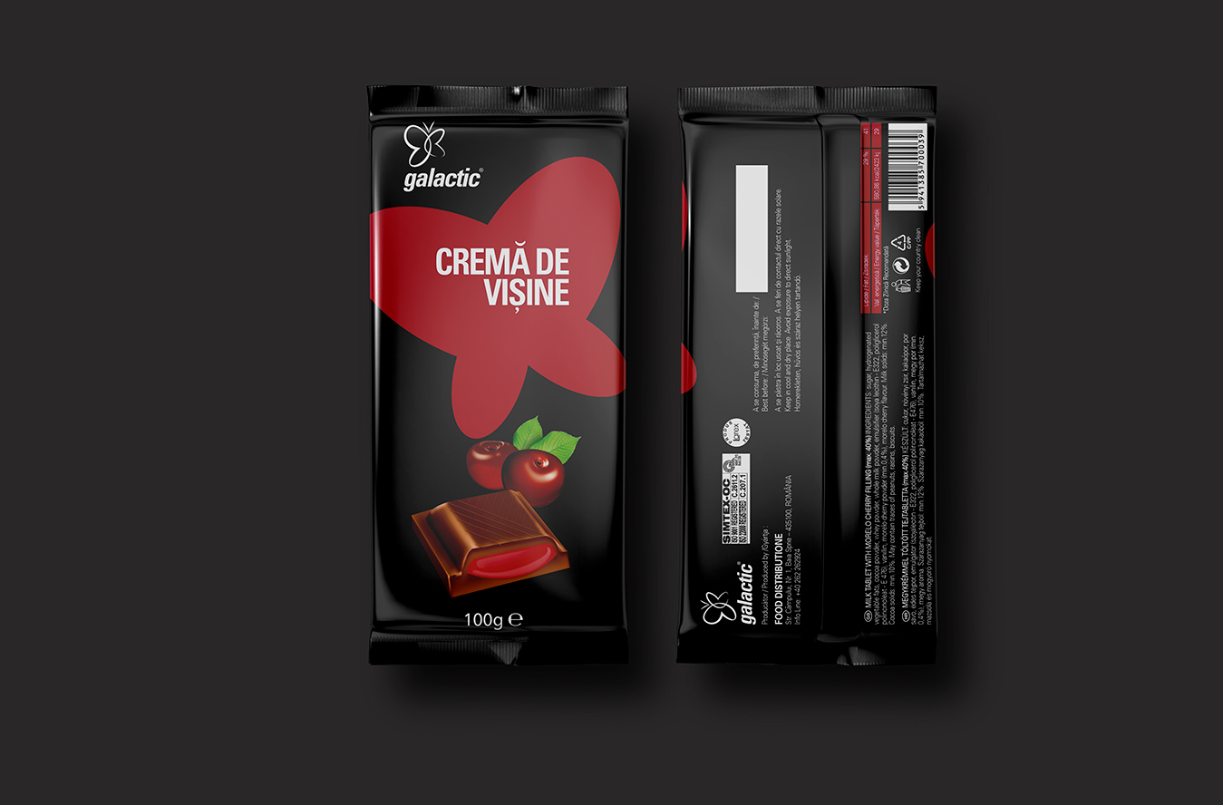
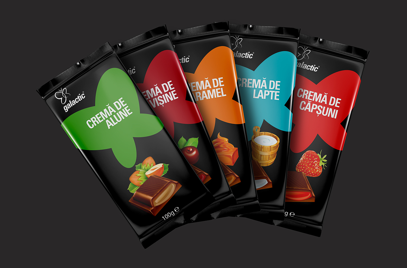
Starting from this idea, the first thing we did was to introduce the black as a brand color and a brand signal. To increase the brand recognition, we used the butterfly symbol from the brand’s logo as a placeholder for the product flavor and product color-coding.
After ensuring a great shelf impact, we added the minimalistic and appealing product illustrations to use the product’s capacity of seduction.