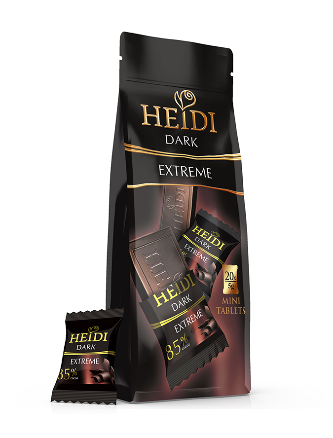
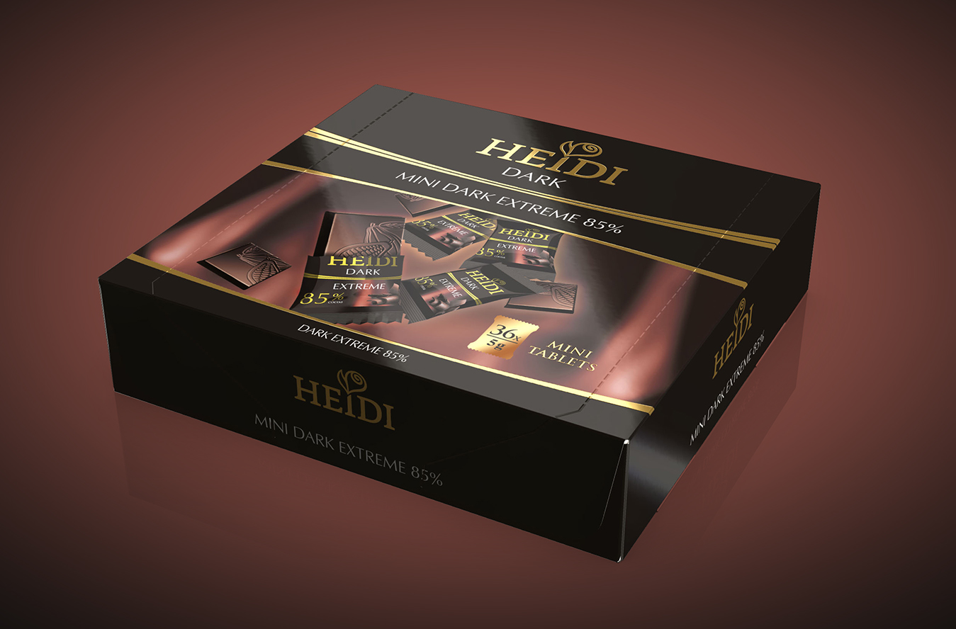
Heidi Mini
Client: Heidi
Brand: Heidi
Project: Packaging design
The Brief:
Heidi Chocolate needed a premium design for their new product: Heidi Mini Tablets. We had to develop the design for the individual packaging, as well as for the box containing the tablets.
The Solution:
The dark chocolate required a dark packaging and we chose the classic black, the iconic color for elegancy, distinction and simple beauty. The golden fonts and special finishing were used to only emphasize the premiumness of the product. The brown background behind the mini-tablets suggests the creamy chocolate and, together with the product shot, generates taste appeal.
Share


