Aectra
Client: Aectra Agrochemicals
Brand: Aectra
Project: Packaging redesign
The Brief:
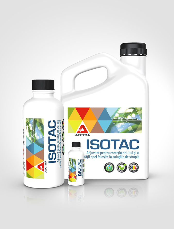
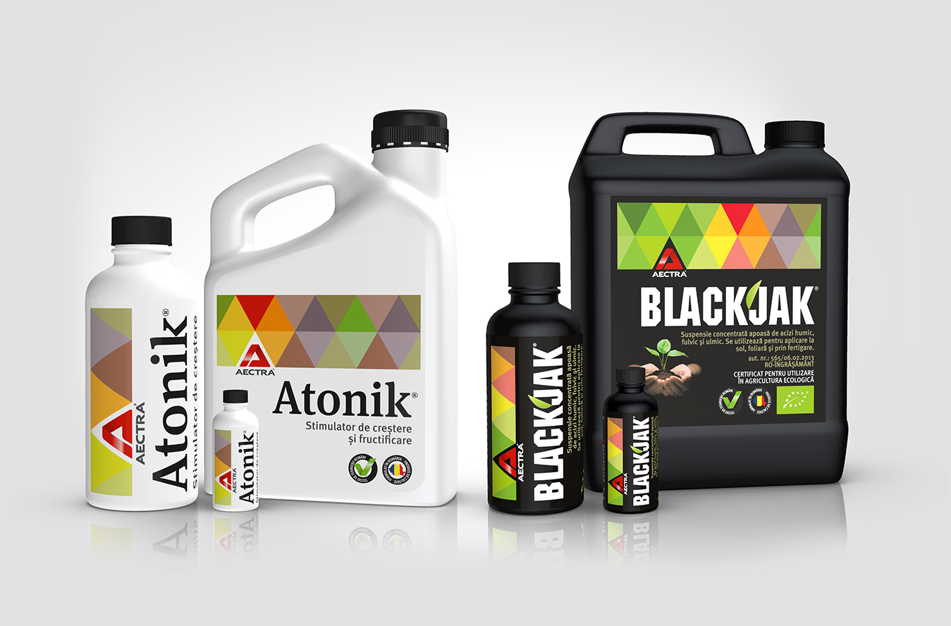
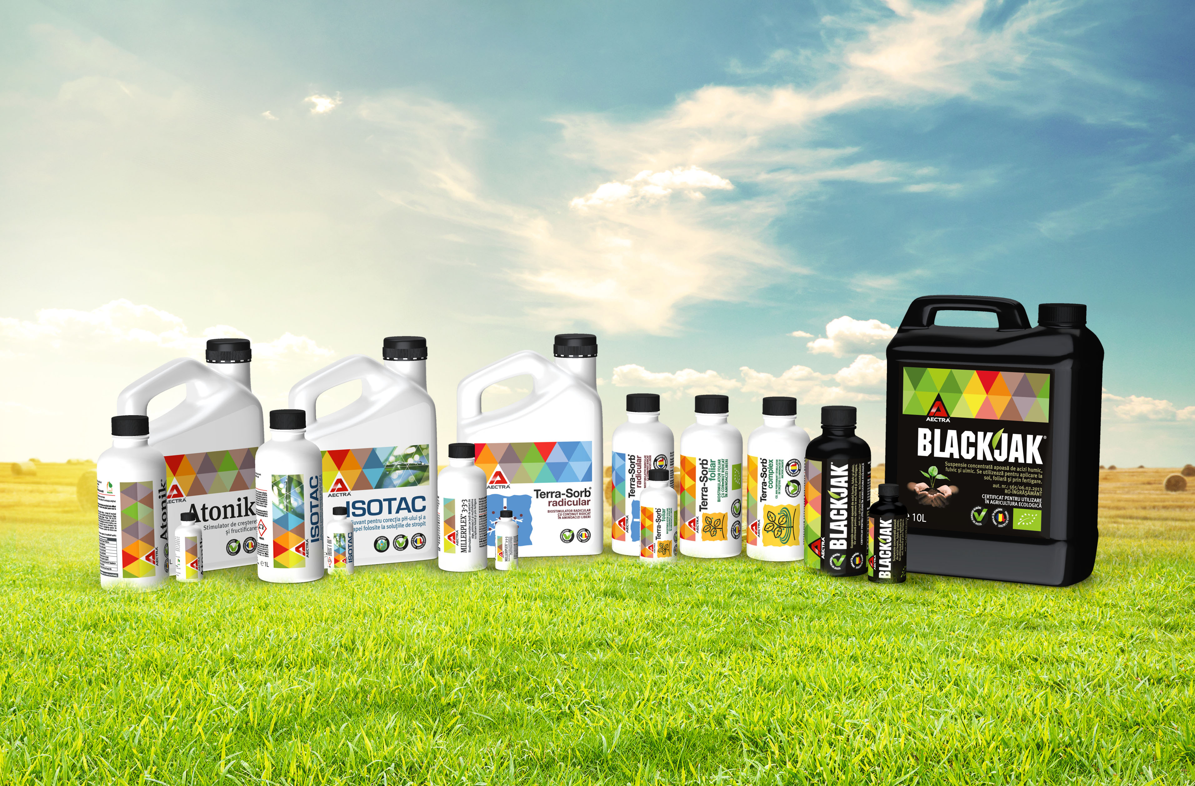
Aectra Agrochemicals is one of Romanian market leaders in the agricultural products and solutions Part of the entire corporate rebranding project, the objective of the packaging redesign was its unification so that it becomes easy to adapt to new products.
The Solution:
“The triangle” – is a symbol of fire, of thought, of feeling. If positioned upside down, it focuses the energy in an ascending direction, being also a male symbol. The downhill triangle signifies fertility and is a feminine symbol. The equilateral triangle symbolizes the balanced man. In nature, the triangle appears as a trinity. In all spiritual cultures, the creation occurs through the interplay of three fundamental aspects of the three strength fields: action, reaction and neutrality.
So, we used a triangle colorful pattern as a brand signal that unifies the packaging design across all products while defining an ownable visual territory for the brand.


