Corset Cigarettes
Client: KT International
Brand: Corset
Project: Global Packaging redesign & line extension
The Brief:
KT International is a leading tobacco company in Bulgaria, with market presence in over 50 countries. The company teamed-up with Ampro for the packaging redesign of their cigarette brand for ladies, Corset.
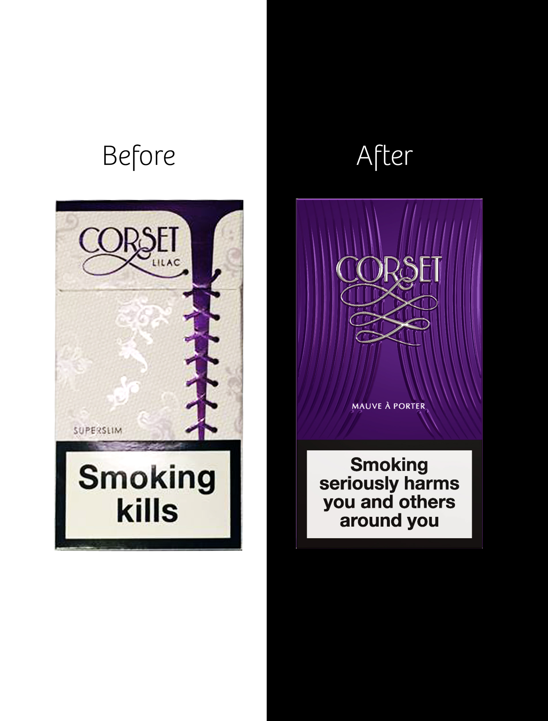
The Corset brand was perceived as being “too provocative, too chatty, gaudily and not elegant enough” and we needed to change that perception into an elegant, chic and premium one. In some Arabic markets the brand packaging was rejected, as it was too provocative.
The Solution:
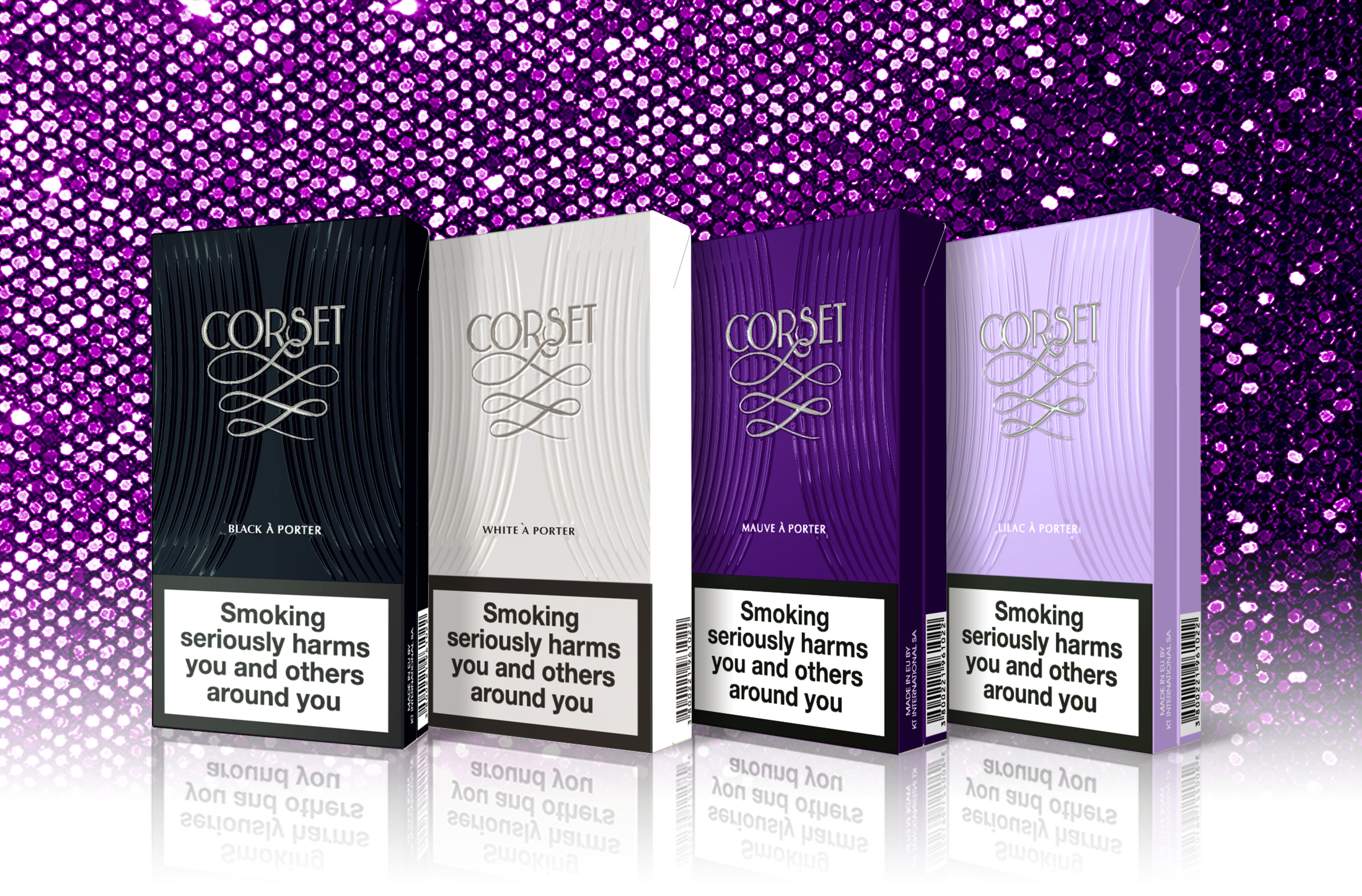
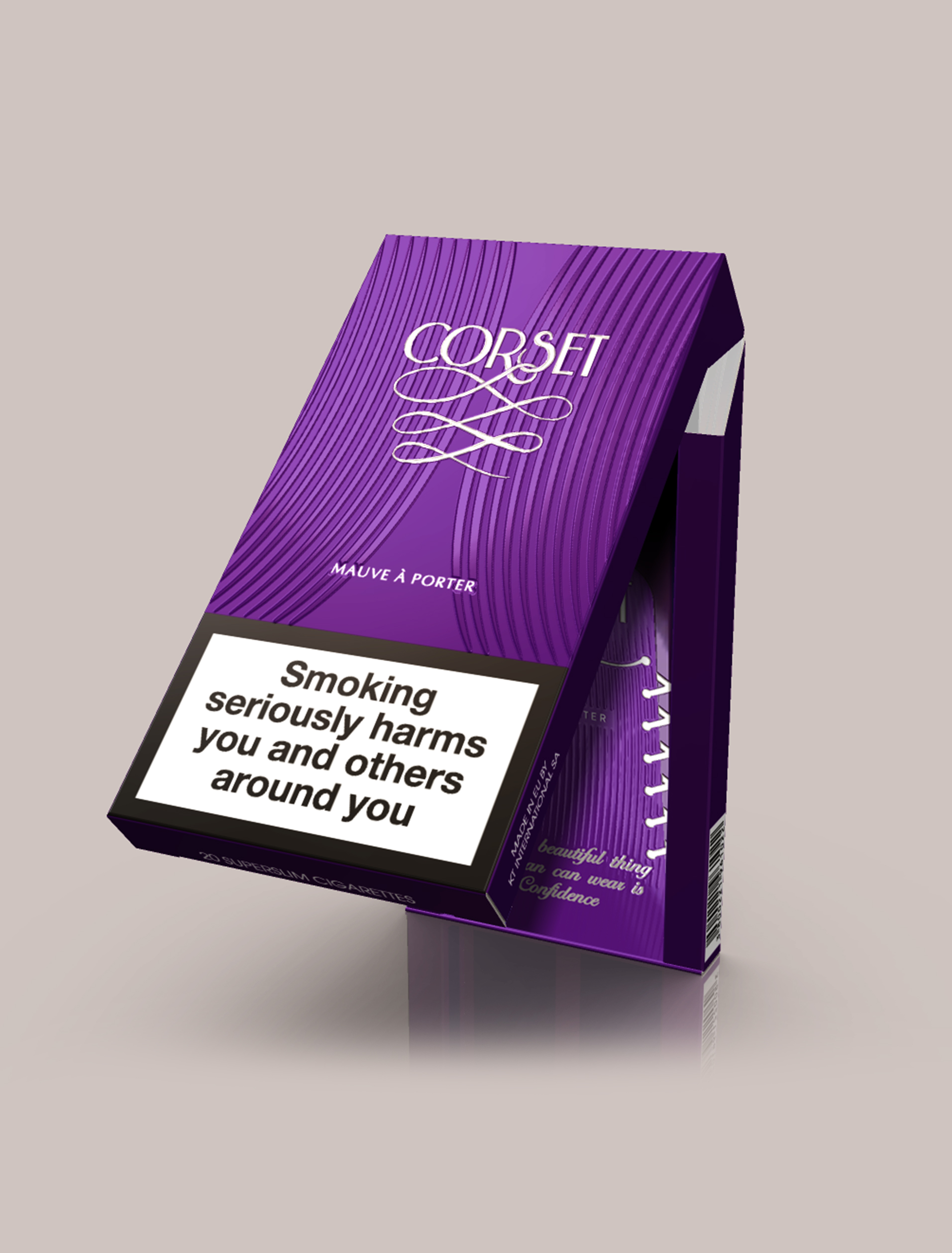
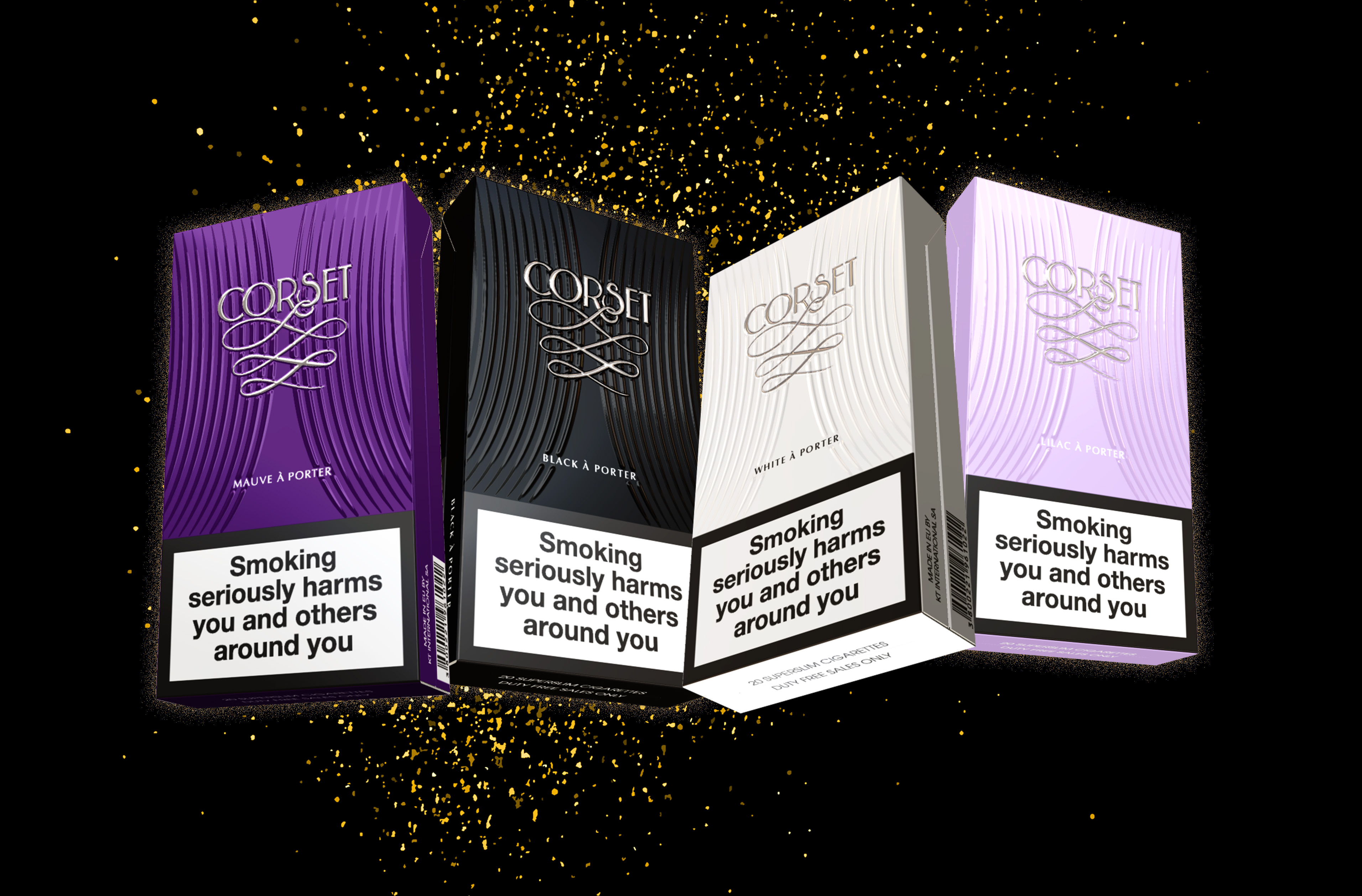
The strategy was to completely change the brand territory from Corset/lingerie, into a fashion-related territory, where the idea of “corset” is subtly introduced.
“Prêt-à-porter”: Ready-to-wear, chic and elegant. This was the new brand territory that best describes the new brand positioning: elegant but not too formal, premium but not exclusive.
From this big idea the new naming system was easily created for the new flavors within the range: Black-à-porter, Pink-à-porter, Mauve-à-porter, White-à-porter. In line with the big idea, we synthesized the corset element into an elegant set of curved lines, and removed the explanatory corset from the packaging. The Corset lace was transformed into a graphical element, part of the new brand logo.