E-Pack
Client: Enigma Trading
Brand: Epack
Project: Packaging redesign
The Brief:
Epack is the mainstream household products brand of Enigma Trading, the top player in the category on the Romanian market.
Ampro’s task was to redesign the Epack brand and packaging with the main goal of gaining shelf presence, but without losing the valuable existing customers.
The Strategy:
Change everything, but make sure it looks the same. It was a real challenge to redesign the packages.
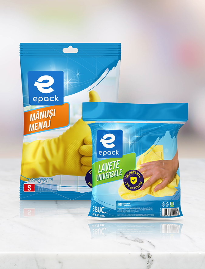
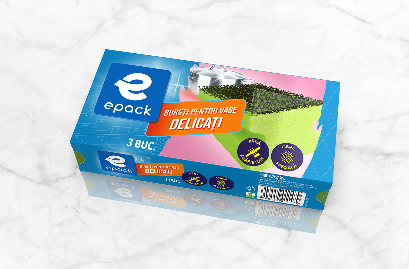
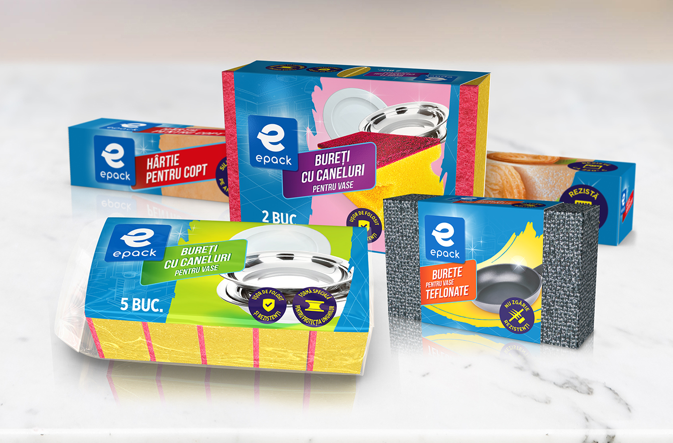
After a visual audit and a consumer test, we decided that the main brand assets were the blue color and the brand logo.
So, the design strategy was to keep the blue color, but improve its size, and to improve the brand logo in order to make it more visible on the front of the pack.
The Solution:
For the design concept, we created an architecture that ensures visibility by transforming the blue color into a brand signal, while optimizing the branding space and placement. We also created a chromatic composition that works on the multitude of pack formats in the portfolio. We enhanced the broadcast performance in general by defining a consistent and coherent imaging style (image style, composition, perspective).