Seleron
Project: Corporate branding
The Brief:
5 years after founding the company and opening the first kiosk, Seleron become the largest distributor in Romania of Yato products, with a storage space of approximately 400 sq m, from which products are delivered to 24 counties within Romania.
The expansion of the client portfolio is limited by the identity of Seleron, which is dusty and can be easily overlooked at the shelf. Our mission was to redesign the brand with a clear, coherent strategy and a visual identity that conveys confidence, professionalism, and seriousness.
The Solution:
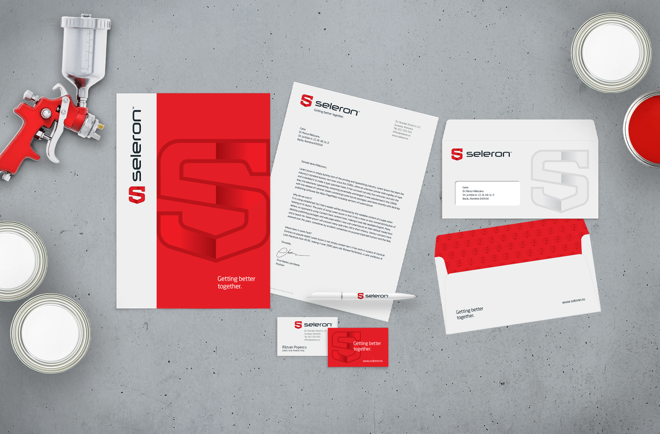
After conducting the in-depth research & audit phase our strategy was to upgrade the visual identity with a logo facelift that says professionalism and create a solid brand platform. For the past 15 years, Seleron’s growth was based on hard work, ambition, openness, and determination. Therefore, the new brand slogan places the internal team and partners in the center of brand’ universe: Getting better together.
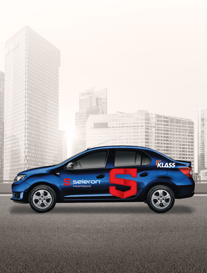
The brand believes in long-term relationships and strong partnerships so the new brand logo must mirror its beliefs. Therefore, we chose a shield as the main element of the logo. The shield symbol conveys protection, because the brand protects the business of customers, but also of suppliers and the entire team.